Hackernews likes this as a practicable application of transfer learning. Fans of machine learning want to see transfer learning as more than a cool trick.
Unfortunately, there is really no good reason for someone seriously interested in accurate information, like a researcher or journalist, to use machine learning for this particular task. Labeling a couple thousand images yourself or with friends is not that big of a task. Do it over a few evenings while watching TV and drinking beer. You could have mechanical turk workers do it for you for a few hundred dollars. In either case you will get extremely reliable information. If you use multiple judges you will have a good estimate of uncertainty for every classification. There is no way transfer learning can provide this uncertainty information.
The main advantage of this technique remains the ability to quickly label very large amounts of data on the order of hundreds of thousands of rows, or thousands of columns. For smaller data, machine learning can sometimes achieve marginal improvements in predictive performance through model complexity. However prediction in smaller data regimes is mainly useful for out-of-sample prediction. The machine learning paradigm offers limited support for measuring uncertainty for out of sample predictions, which is super important if you are a researcher.
One capability of transfer learning could be to support many many applications from one model, but I have yet to see demonstrations of this in practice. The problem is that knowing how well learning has transfered requires measuring generalizabity and so cannot be done blindly.
I don't think extreme accuracy matters that much when dealing with large sample sizes. If the margin of error is under 3% (like opinion polls) then it's good enough for many purposes.
The "margin of error" reported in opinion polls is typically just a function of the sample size and sample variance. The error is assumed to be due to statistical variation, not to problems with measurement. Measurement error is a bigger problem than statistical variation because statistical variation can often be assumed to be unbiased.
My comment above is not about statistical variation, it is about measurement error. Inaccuracies in models for labeling images are a form of measurement error. Having humans label a (often stratified) sample of images is required to understand the measurement error. This requirement is the main difficulty when it comes to generalizing learning from one context to another. If you use multiple independent humans to label all your images, you can understand the errors made by the humans very well.
It might be better if the title were this line from the subtitle:
A brief analysis of gender distribution in visual representations of everyday life in North Korea
The actual title gave me the impression this was a run of the mill, shallow complaint about sexism (with, possibly, some ugly politics thrown in to boot). It took me a while to get curious about it based on other cues that this might not be the case. This piece is interesting for reasons having nothing to do with the sexism angle. It is a rich piece about history, culture, AI and possibly other things, given that I don't have time to read all the way through it at this time.
This makes sense to me, because North Korea is still technically at war with South Korea. During WWII, when all members of the male-dominated workforce were overseas fighting, the propaganda posters were mostly centered around female participation in the workforce.
If your country has been at war for over 60 years, I suppose your society would develop a kind-of "gender-agnostic" workforce, or perhaps a total reversal of demographics from a country who is at peace.
If only this explained, South Korea would also show its "gender-agnostic" face, but it doesn't happen. Imo the thing is in the difference of political/economic regime.
South Korea may technically be at war with North Korea, but very few South Koreans would tell you they live in a country in a state of war. In reality, the war is more a theoretical threat. Whereas in North Korea, people are constantly being conditioned to believe that, in fact, they are in a constant state of war.
This assumes a much higher level of complete acceptance of propaganda than I think is reasonable, especially considering the people driving labor policy are presumably in the more elite levels of society.
Surely if state's propaganda is intended to condition people to accept that they are at war, then propaganda is going to reflect the labour norms of a society at war, whether people accept the truth of the necessity to be on a war footing or not? And we're also talking about a country where it's widely reported that nearly every young man gets conscripted for an extended period of time and is regarded as a reservist when not on active service. I suspect the North Korean diplomatic service strongly selects against policy wonks who come up with cunning imperialist traitor ideas like "maybe if we disregard the Dear Leader's emphasis on the importance of maintaining the appearance of military strength we'd have more available able-bodied labour to make stuff"
So yes, it's likely actually true that in rural North Korea women actually do work the land (in common with many other poor countries, especially ones with food shortages and menfolk frequently conscripted or called up for army reservist drills) but are lower priority for enlistment into for resource extraction or front line military service, because North Korea needs all the farmers it can get but (in common with many other societies) doesn't see women as particularly suited to mining or guarding the country's borders. But even if that wasn't the case, it's likely the posters would still promote those gender roles. If anything, they might be downplaying the likelihood of women being drafted.
> And we're also talking about a country where it's widely reported that nearly every young man gets conscripted for an extended period of time and is regarded as a reservist when not on active service.
Yeah, but my main point here is we spend so much time focusing on what's odd about North Korea that we start to act like they're not humans. They aren't morons. I remember reading an interview with a North Korean defector and he was talking about how anyone who lives there learns to read between the lines of news stories. So like the example he used was, if all the sudden the newspaper started talking about heroic Iraqi rebels fighting the United States, you'd learn "Oh, so the United States has taken over Iraq," even though none of that context would necessarily have been presented to you.
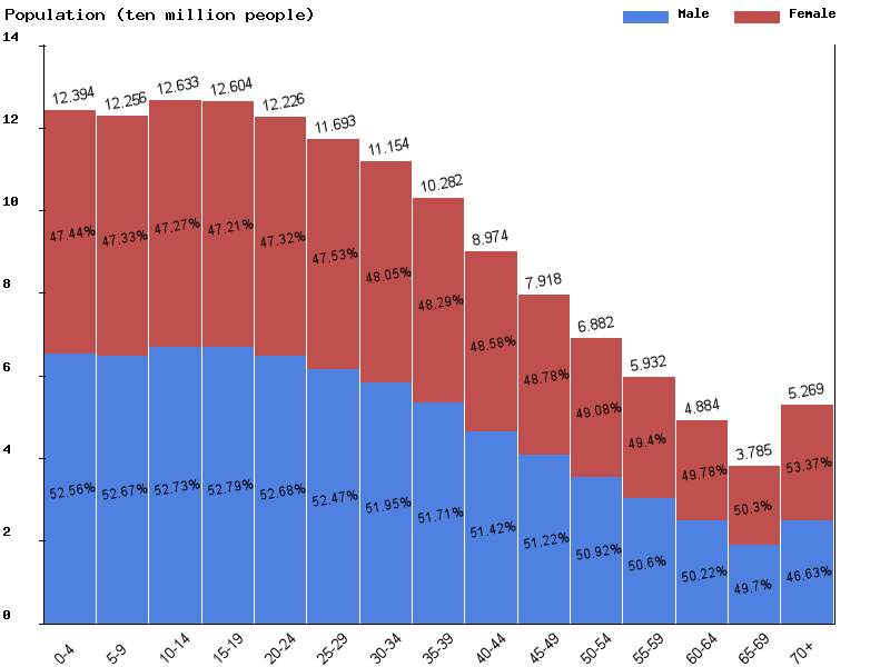
that has its benefits, but you also loose the ability to see the difference between men and women across the distribution. like the ratio at 70+ vs the ratio at 0-4
True - I tried to find an example where it was centered horizontally - but couldn't quickly. Ideally I would like this (ignore the terrible paint job and alpha channel messing things up):
Where you see both volume, distribution, percent, as well as the trendline (white) where you can see how the distribution changes - how the total count changes, and easily understand any data point at any given spot.
That chart actually force me to look at the key multiple times. Perhaps I am tired but I kept wanting to use the top key "female" for the top line within the chart....strange.
The obvious way to make the charts easier to interpret would be to use pink and blue.
Who knows why the author used green and yellow - feels 'blue for a boy and pink for a girl' is outdated and sexist, or just likes green and yellow better, or they're the default from their charting program, or a chosen colour scheme for the blog. But there's no doubt (for readers in the English-speaking world and who knows how many countries) what would be clearer, to the point of hardly needing a key.
Most interesting. It'd be nice to see this sorted by age as well, to infer whether the distribution of gender had changed over time. And...well it's easy to imagine many other contexts that it would be good to see similar analyses applied to.
I wonder if/how this will change now that Kim Jong Un has promoted his sister to more visible public roles.


Unfortunately, there is really no good reason for someone seriously interested in accurate information, like a researcher or journalist, to use machine learning for this particular task. Labeling a couple thousand images yourself or with friends is not that big of a task. Do it over a few evenings while watching TV and drinking beer. You could have mechanical turk workers do it for you for a few hundred dollars. In either case you will get extremely reliable information. If you use multiple judges you will have a good estimate of uncertainty for every classification. There is no way transfer learning can provide this uncertainty information.
The main advantage of this technique remains the ability to quickly label very large amounts of data on the order of hundreds of thousands of rows, or thousands of columns. For smaller data, machine learning can sometimes achieve marginal improvements in predictive performance through model complexity. However prediction in smaller data regimes is mainly useful for out-of-sample prediction. The machine learning paradigm offers limited support for measuring uncertainty for out of sample predictions, which is super important if you are a researcher.
One capability of transfer learning could be to support many many applications from one model, but I have yet to see demonstrations of this in practice. The problem is that knowing how well learning has transfered requires measuring generalizabity and so cannot be done blindly.